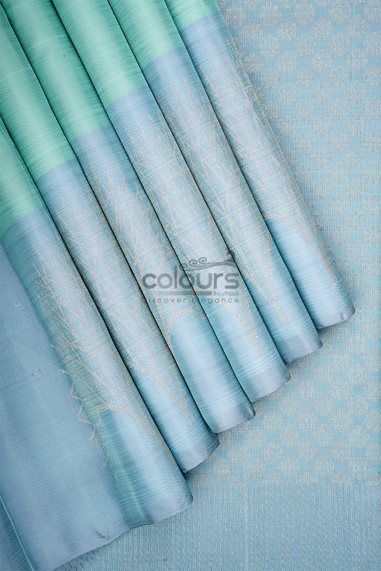
Before buying a powder blue and mint green saree online, verify which colour appears in each part of the garment. A two-colour listing can look different when spread flat, folded for display or arranged on the body.
Colours Arani Kanchipuram Silk Sarees – CB001 – 2015004-BL is described with a powder-blue body, a mint-green section identified as a yoke, and a large antique-gold tree-inspired jacquard motif. Understanding that layout will help you make a better blouse decision than choosing from the colour names alone.
Start with the full arrangement
Look for a photograph that shows how the blue and mint areas connect. Then inspect the motif separately. A close-up of the tree detail cannot establish how much blue or green will be visible in a completed outfit.
The term “yoke” in the product description identifies a design section; do not assume it tells you exactly where that section will fall in your own drape. Ask the boutique to clarify the layout if it is not obvious from the photographs.
A helpful question is: “Can you show the full saree and indicate the mint section relative to the pallu and the end used for tucking?” That is more precise than asking whether the saree is mostly blue.
Distinguish panel colours from changing reflections
A saree may contain separate coloured areas, and woven fabric can also look different as light changes. These are different issues.
For this product, the description explicitly identifies blue and mint sections. Do not infer that every apparent colour change in a photograph is another panel, or that the garment will always show the same balance as a styled image.
Compare several original photographs where available. If a shade is crucial, ask for an additional image in neutral light. A photograph can improve understanding, but it cannot guarantee an exact screen-to-fabric match.
Avoid using a heavily filtered screenshot as the reference for ordering blouse fabric. The extra image processing adds another source of uncertainty.
Decide which colour the blouse should support
A compatible powder-blue blouse can extend the main body colour. A mint blouse can repeat the secondary area. A quiet gold-toned blouse could connect with the tree motif, although its shine may change the visual emphasis.
Before selecting one, decide what you want to notice first. Blue continuity can keep the whole outfit calm. Mint repetition may make the two-colour relationship more visible. A gold blouse can create a stronger decorative focus.
These are choices about the finished composition, not rules about skin tone or age. Try the options you feel comfortable wearing.
The most reliable colour comparison is with the actual saree. If possible, postpone final fabric matching until you can place the pieces side by side.
Keep the tree motif distinct
The tree-inspired jacquard is a large design element. Give it space when comparing blouse patterns.
A blouse covered in another botanical print may compete with it. A plain surface is a useful first test, even if you later choose some embroidery or texture.
Consider the visible motif location when arranging jewellery. A long necklace or a bag held across that area can obscure the detail that attracted you. You do not need to eliminate accessories; simply decide which element should lead.
Ask for the motif’s placement to be explained if the photographs do not show it clearly. Do not commission blouse decoration based on an assumed position.
Plan tailoring in the right order
First confirm what is included in the purchase, including any blouse fabric. Next, inspect the saree and settle the colour direction. Only then finalise blouse fabric, lining and decorative additions.
This sequence is especially useful when shopping across borders. A blouse commissioned from a screenshot in one country may not match the saree delivered to another.
For India orders, check international delivery and any applicable charges. For Singapore orders, confirm the address-specific timing and leave room for tailoring. Neither route should depend on an unverified promise of arrival before Deepavali.
The online buying guide covers broader purchase checks. For this design, panel placement and colour matching deserve particular attention.
Decide whether the palette fits your wardrobe
The powder-blue and mint combination may appeal if you prefer a softer festive palette with one larger decorative motif. It may be less suitable if you want a single consistent colour from body to pallu.
Look at the blouses you already own before ordering anything new. A compatible option can make preparation simpler, even if it is not an exact match.
Compare other designs in the saree collection if the panel layout remains a concern. A clear understanding before purchase is more useful than trying to correct an unexpected colour balance later.
Frequently asked questions
Can I match blouse fabric accurately from a screenshot?
A screenshot is only a starting point. Display settings, lighting and image processing can change colour appearance. Compare physical fabrics where possible.
Does “dual-tone” mean the entire saree changes colour in light?
Not necessarily. This description identifies powder-blue and mint sections. Ask about the actual layout rather than assuming an iridescent effect.
Is the tree motif printed?
The product description identifies it as a jacquard motif. Do not substitute a different construction based only on a photograph.
Should I finish the blouse before the saree arrives?
If exact colour matching matters, it is preferable to compare the actual saree before making irreversible tailoring decisions.
Inspect the blue-and-mint layout
Explore CB001 – 2015004-BL and review the full photographs, panel relationship and tree motif before completing your Deepavali outfit plan.