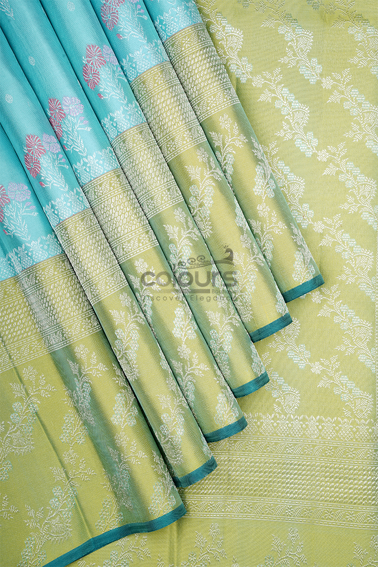
Pleating changes how much of each colour you see in a saree. Before choosing a two-colour design, understand the panel layout and compare it with the drape you prefer to wear.
The CB001 – 207041-KO Colours Arani Kanchipuram Silk Saree is described with a sky-blue section transitioning into a lime-green body, self-woven floral-vine motifs and a broad gold zari border. Its appeal lies partly in that colour relationship, so it deserves a more thoughtful trial than simply copying a photograph.
Learn where the colour transition sits
Begin with the full product images. Identify where the blue section meets the lime body and where the broad border runs.
The description uses the word “yoke” for the blue section. Ask the boutique to explain the full layout if that term does not make the placement clear to you. Do not assume the blue will fall in exactly the same place on every wearer.
A flat photograph and a styled photograph can each help, but answer different questions. The flat view reveals the design arrangement; the draped view shows one possible way to wear it.
Your own pleats, tuck and pallu arrangement may produce a different balance.
Start with your normal drape
When you can trial the saree, use the blouse, supporting layers and footwear you intend to wear. Begin with an arrangement you already find manageable.
Check how much sky blue and lime appear before making changes. You may find that the original arrangement gives a colour balance you like.
If it does not, identify the specific issue. Is too little blue visible? Does a fold hide the transition? Is the broad border turning inward? A precise observation is more useful than repeatedly redoing the entire drape.
Seek help from an experienced draper if the layout is unfamiliar. There is no benefit in forcing a decorative result that makes movement difficult.
Change one fold decision at a time
Pleat width and placement can affect what remains visible. Compare one adjustment, then walk and sit before deciding whether it is useful.
Avoid promising yourself a fixed number of pleats based on an online image. The practical arrangement depends on the garment, your preferred style and how it fits on you.
If a colour section becomes partly hidden, that is not automatically a problem. The remaining visible area may still establish the intended contrast.
The aim is a balanced outfit, not a requirement to display every section in equal proportions. Blue and lime do not need to occupy identical areas to feel connected.
Keep the broad border clear without letting it dictate everything
The gold border adds a defined edge and contains floral, paisley and geometric patterns. Check how it appears at the front and along the lower drape.
A fold may reveal only part of the pattern. Decide whether the visible section still looks intentional. Do not lower the hem or restrict your stride merely to show a wider strip of zari.
Test the arrangement with the footwear you will use, including any footwear removal that is relevant to your plans.
The draping guide provides the broader movement checks. This article’s specific focus is how those choices alter a two-colour design.
Use the blouse to support the final colour balance
Only finalise the blouse direction after you understand which colour will be most visible in your intended drape.
A compatible blue blouse can repeat the blue section even when that panel is less prominent. A lime direction can extend the body colour. A gold-toned blouse adds another large decorative area and should be compared carefully with the broad border.
These options do not mean matching blouse fabric is included. Confirm the purchase details before tailoring.
A plain blouse surface is a helpful starting point because the saree already combines two colours, floral vines and a patterned border.
Take a useful reference photograph
Once the drape feels comfortable, take a front and side photograph in ordinary light. The purpose is to record the colour arrangement you can recreate, not to produce a perfect promotional image.
Note which adjustment made the most difference. A simple reminder about the transition or the first fold can save time when dressing for the event.
Do not judge comfort from the photograph alone. Keep the version that works while moving as well as standing.
For India and Singapore celebrations, base the trial on the actual activities ahead. A seated gathering and an evening with more walking need different practical emphasis.
Choose the design with confidence
This blue-and-lime saree may suit someone who enjoys visible colour blocking with woven detail. If you prefer a single uninterrupted body colour, compare alternatives in the saree collection.
Before ordering, ask for any missing dimensions or layout images that affect your decision. Clear information is more useful than assuming that the product will reproduce a particular styling photograph automatically.
Frequently asked questions
Will the blue section sit in the same place on everyone?
Not necessarily. The visible arrangement depends on the garment layout and the drape. Ask for clarification before buying if placement is important.
How many pleats should I make?
There is no fixed number established for this product. Use a comfortable arrangement appropriate to the saree and your preferred drape.
Must the blue and lime be equally visible?
No. A deliberate unequal balance can still show the two-colour design effectively.
Does the broad border establish the garment’s weight?
No. Ask for weight information separately if it affects your choice.
Explore the full colour layout
View CB001 – 207041-KO and consider how its blue, lime and gold areas will work in the drape you actually enjoy wearing.