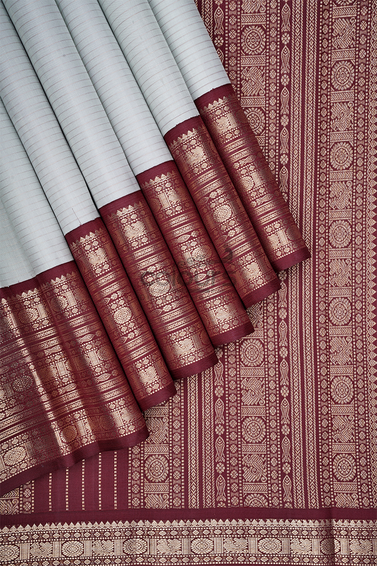
With an ivory and coffee brown saree, compare the warmth and shine of accessories rather than relying on names such as “cream” or “gold.” Similar labels can conceal noticeably different tones.
The CB001 – 2011009-KO Colours Arani Kanchipuram Silk Saree has an ivory-cream body with horizontal woven stripes and a coffee-brown-and-antique-gold border. The border includes floral, temple and geometric motifs. This palette offers a useful exercise in coordinating warm neutrals without making every item identical.
Separate colour from finish
Two accessories can share a gold colour but have very different surfaces. One may be bright and polished; another may be quieter or more textured.
The saree’s antique-gold description gives a visual direction, not a guarantee that any accessory labelled antique gold will match it. Compare the items together.
The same applies to ivory. A blouse or bag described as ivory may lean more yellow, pink or grey than the saree body.
Look at the relationship between the pieces rather than judging each label independently. A deliberate contrast can be attractive, but an accidental near-match may not produce the effect you expected.
Let coffee brown provide definition
The coffee-brown border gives the pale body a darker frame. Repeating a compatible brown in a blouse or bag can connect the outfit without adding another strong colour.
Choose how much brown you want to show. A brown blouse creates a larger area near the face; a smaller bag or accessory gives a quieter repetition.
A compatible ivory blouse keeps the body colour more continuous and leaves the border as the main contrast.
These are alternative styling directions. You do not need all of them at once, and blouse-piece inclusion should be confirmed separately.
Compare metallic accessories beside the border
Place one jewellery option next to the actual border. Then compare another while keeping the rest of the outfit unchanged.
Notice whether the accessory appears much brighter than the woven detail. If so, decide whether you want it to become the focal point.
You may prefer the contrast. Matching every finish exactly is not compulsory. The important step is making the choice consciously rather than assuming all gold-toned pieces are interchangeable.
Do not infer the material composition of the zari or jewellery from colour. This is a visual styling comparison, not a test of precious-metal content.
Give the stripes some space
The body’s horizontal woven stripes add structure to the pale area. They may appear more subtle from a distance, but they still contribute to the outfit.
A blouse with strong stripes in another direction can create a more complex effect. Try a plain surface first if you want the saree’s own lines to remain clear.
A bag with a quiet finish can also help. If you choose a patterned bag, compare it beside both the striped body and the detailed border.
The palette may look restrained, but the saree is not without pattern. Treating it as completely plain can lead to more decoration than you intended.
Check the outfit in the light you will use
Warm room light and daylight can create different impressions of ivory and metallic finishes. Compare the outfit in more than one ordinary setting.
You are not trying to establish an exact colour measurement. You are checking whether the relationships remain appealing to you.
If an accessory looks harmonious in daylight but becomes the dominant bright element indoors, decide whether that works for the celebration.
For an India home gathering or a Singapore Deepavali dinner, use the likely venue conditions as a guide. Neither market requires a particular metallic finish.
Choose neutral dressing for your own reasons
Ivory and coffee brown may appeal if you enjoy warm, quieter body colours with a defined border. It is not a compulsory choice for any age group or occasion.
Check any event-specific colour expectations before deciding. A neutral palette can still be festive through its woven detail and accessories, but you should feel comfortable with the overall mood.
If you prefer a brighter body colour, there is no need to choose ivory simply because it appears easier to coordinate.
The colour-combination guide explains the broader idea of assigning colours different roles. Here, the detailed task is comparing near-neutrals and metallic surfaces.
Avoid buying every component from a separate photograph
If possible, use the actual saree as the reference for a blouse, bag and jewellery. Ordering each item from a different screen image can multiply small colour differences.
Start with pieces you already own and compare them physically. You may only need one addition, or none at all.
Explore the saree collection if you want a warmer, cooler or stronger colour contrast. The most useful palette is the one that connects with your wardrobe and taste.
Frequently asked questions
Must the blouse be an exact ivory match?
No. A deliberate brown or another compatible option can work. If you want a close ivory match, compare physical fabrics.
Can I mix bright gold and antique-gold finishes?
Yes, if you like the complete effect. Compare them in the intended lighting rather than assuming they will blend.
Is the body completely plain?
No. The listing describes horizontal woven stripe detailing.
Does antique gold describe the zari’s purity?
No. It describes the visual finish here. Composition requires separate evidence.
Compare the warm palette in full
View CB001 – 2011009-KO and consider the ivory body, brown border and gold detail together before choosing your festive accessories.