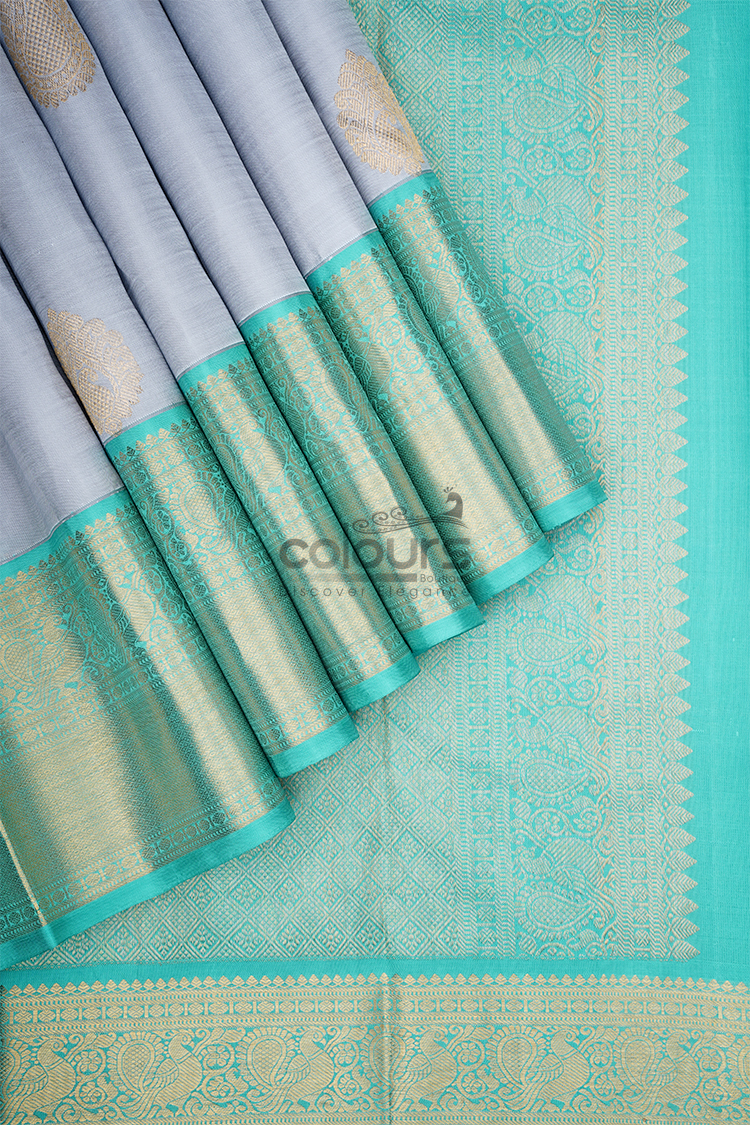
A coordinated Navaratri outfit starts with the colours already present in your saree. Repeat a shade, add a deliberate contrast or use a quiet supporting colour to let the saree lead.
For shoppers in India and Singapore, Colours Boutique’s ash-grey saree with a teal-green and antique-gold border provides a neutral-and-contrast palette to work with. The combinations below are styling suggestions, not traditional daily Navaratri colour assignments.
Read the complete palette
Look beyond the largest area of colour. The body, motifs, border and edge can each contribute a shade that guides the rest of the outfit.
Compare the written description with the product photographs. Screen settings and lighting can change colour appearance. If an exact match matters, request clarification and compare physical fabrics whenever possible.
Begin with one decision: which colour should dominate? This helps you evaluate a blouse or accessory as part of the outfit rather than as an attractive item in isolation.
Ash grey and teal: repeat the border colour
The CB001 - 2011004-KO saree is listed in Korvai / Pethni / Benth. Its description identifies an ash-grey plain body and a teal-green antique-gold zari border with floral, paisley and temple-inspired motifs.
A teal-led supporting palette
A teal blouse can repeat the border shade and make the contrast part of the main outfit. Compare the exact teal against the saree because blue-green fabrics can differ noticeably.
With grey as the largest colour area, the blouse and border can supply the brighter focus. Avoid introducing several extra strong shades before comparing the result.
Grey on grey: emphasise the body
A compatible grey blouse offers a tonal alternative. The teal border then remains the clearest colour contrast.
Grey fabrics can lean warm, cool or metallic. Compare the actual pieces in more than one light instead of assuming that two fabrics with the same colour name match.
Use texture or blouse shape for definition if you prefer a tonal look. A restrained body palette does not require a highly embellished blouse, particularly when the border already has woven detail.
Use gold as an accent, not another large block
The border already contains antique-gold detail. Try a restrained metallic accent in jewellery or a bag before adding a highly reflective blouse as well.
If you want a gold-toned blouse, compare it with the actual woven finish and keep the other accessories quieter. Metallic colour names do not guarantee that two finishes look identical.
The border’s floral, paisley and temple-inspired motifs already provide decoration. Leave some clear space around them instead of adding accessories simply to fill every area of the outfit.
Use a dominant, supporting and accent colour
Identify the role of each main shade. For this design, grey can dominate, teal can support and gold can act as the accent. Change the balance deliberately if you choose a tonal or metallic blouse.
This is an editing exercise, not a rule prohibiting more colours. Its purpose is to reveal an item that adds complexity without improving the outfit.
For construction and fit, use the blouse pairing guide. For accessory scale and finish, see jewellery for Navaratri sarees.
Compare the palette in more than one light
Place the intended pieces together in daylight and in the type of indoor lighting you expect to encounter. You are checking their relationship, not trying to establish an exact colour from a photograph. If a shiny blouse dominates under indoor light, compare it with a quieter alternative. Keep a simple reference image of the combination you prefer so that later accessory choices follow the same direction.
Keep the border visible when comparing combinations
Arrange the saree as you expect to wear it before judging the palette. A blouse that repeats teal may look different if the border is mostly hidden, while a grey blouse may create a larger continuous colour area than you expected. Take a reference photograph with the intended bag and footwear, then remove one accessory and compare. This makes the colour decision about the whole outfit rather than separate pieces.
Compare colours for the venue in India and Singapore
In India, use the lighting of your actual home, hall or outdoor venue when assessing grey and teal rather than choosing by a general regional label. In Singapore, compare the outfit in the indoor venue’s lighting as well as in daylight during travel. Screen images cannot reproduce every lighting change. If ordering fabric or a blouse separately in either country, compare against the delivered saree whenever possible. The same palette can work in both markets without requiring country-specific colour rules.
Frequently asked questions
Are these prescribed daily Navaratri colours?
No. They are palettes based on the selected products.
Must the blouse match exactly?
No. A deliberate contrast can work well; physical comparison helps if you want a close match.
Can I mix metallic finishes?
Yes, if you enjoy the complete result. Exact finish matching is not compulsory.
Which palette needs the fewest purchases?
The one that connects with comfortable blouses and accessories you already own.
Build your festive palette
Explore Colours Boutique sarees and use the Navaratri buying guide to compare colour preference with your occasion and budget.